More space for your data and better navigation: Meet the new Forest Admin UI
More space for your data and better navigation: Meet the new Forest Admin UI
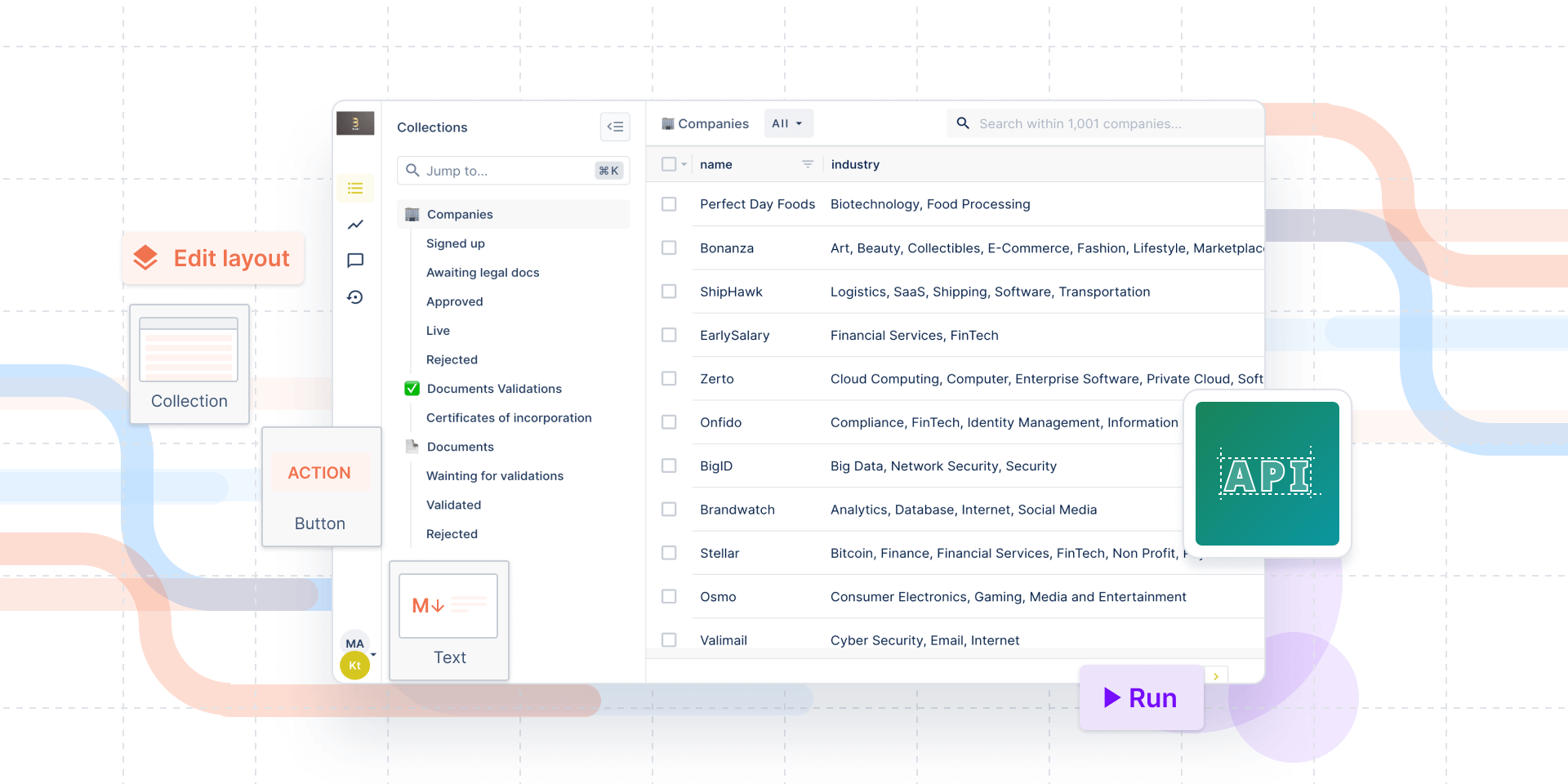
Almost every time we ask our users why they have chosen Forest Admin instead of an open-source solution or building their internal tools from scratch, we hear their user interfaces leave much to be desired. Users demand software that is intuitive and well-designed, and that gives them the flexibility to personalize, ideally with little or zero help from developers who should rather spend time on the customer-facing app.
At Forest Admin, we understand the importance of good UI and we strive to make it better. Every day, we are happy to see how the businesses of our clients grow, but it also means we needed to improve the way they control even very complex operations.
That’s why today we are excited to announce the result of a great team effort, research, interviews, and analyzing users feedback: the new Forest Admin UI. 🚀
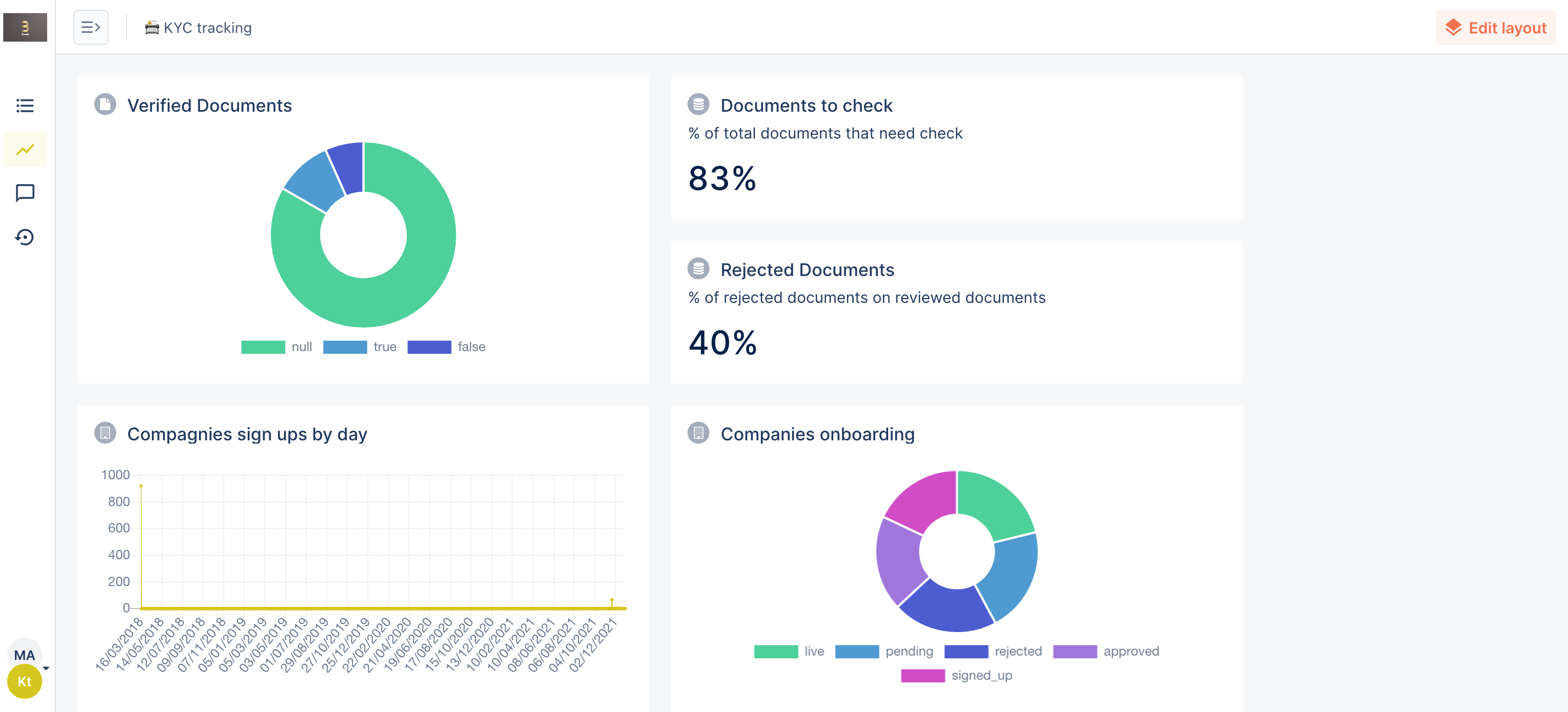
Disclaimer: At the moment, the old UI is still the default one. You can turn it on in your profile's setting and go back to the old one anytime you want.
The new UI is not a revolution, your Forest Admin internal tool will still look familiar. We have redesigned the navigation and made it possible to hide the Collections list so that you can build more complex operational workflows on a single page.
New Forest Admin UI: What has changed
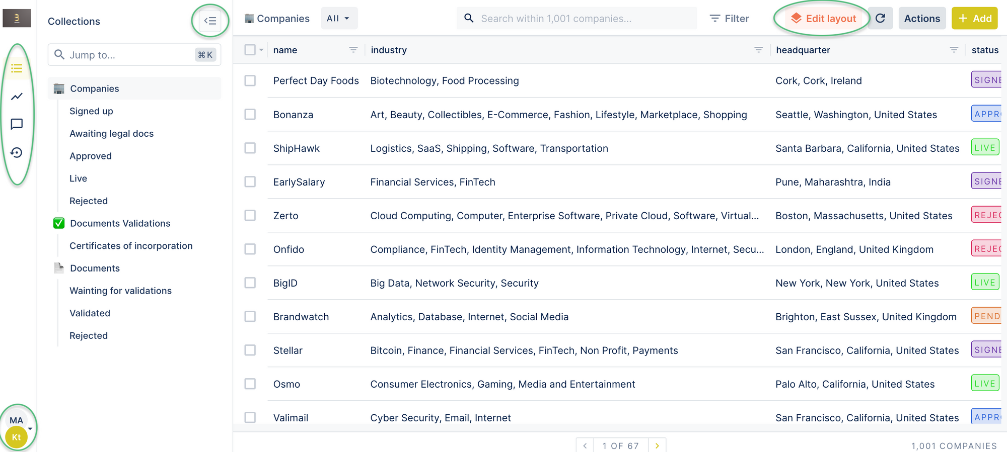
- Your table views remain available as they were, you can also easily edit them with the layout editor, which has got a new button in the top-right corner.
- The most significant change takes place in the navigation. We have moved the main navigation bar from the top to the left and replaced the names of each tab with their respective icons.
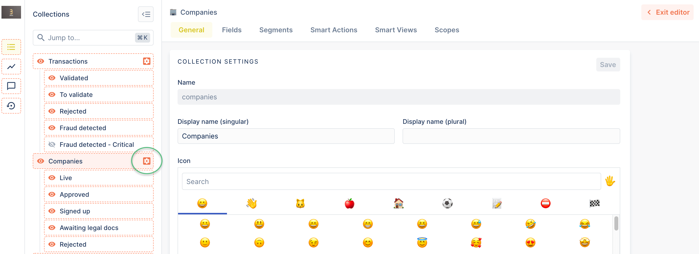
- The Collections list is redesigned and can be quickly hidden by clicking on the icon next to it. You can illustrate your collections with any emojis you want. 🌲
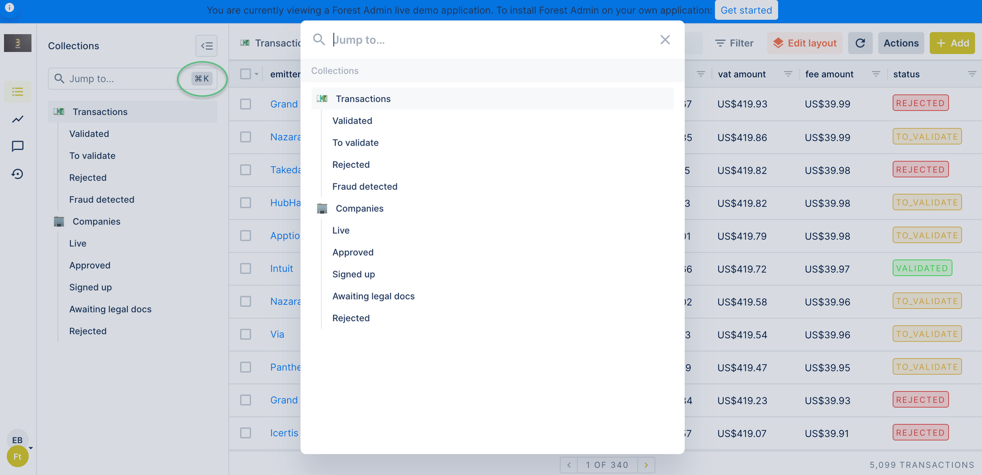
- We have added a shortcut cmd+K (or ctrl+K for Windows) that lets you open a collection list from any page of the app.
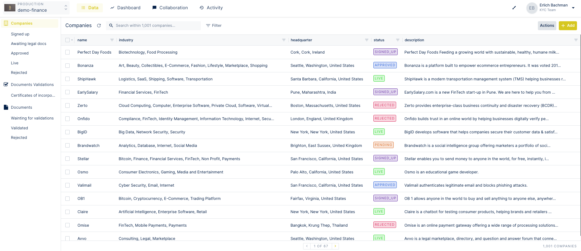
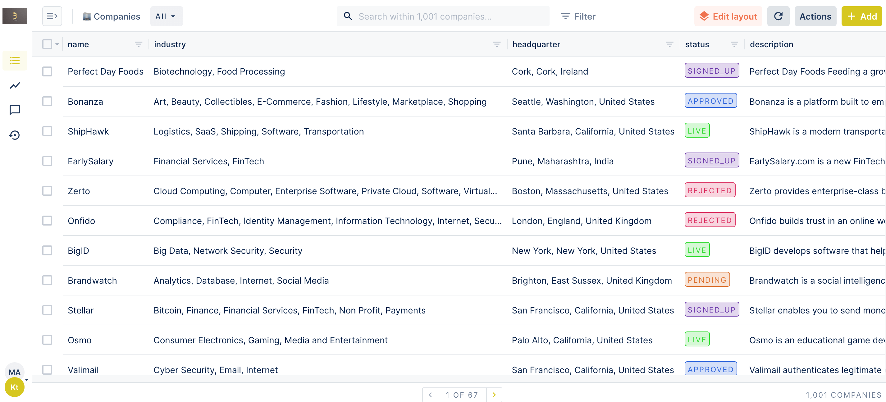
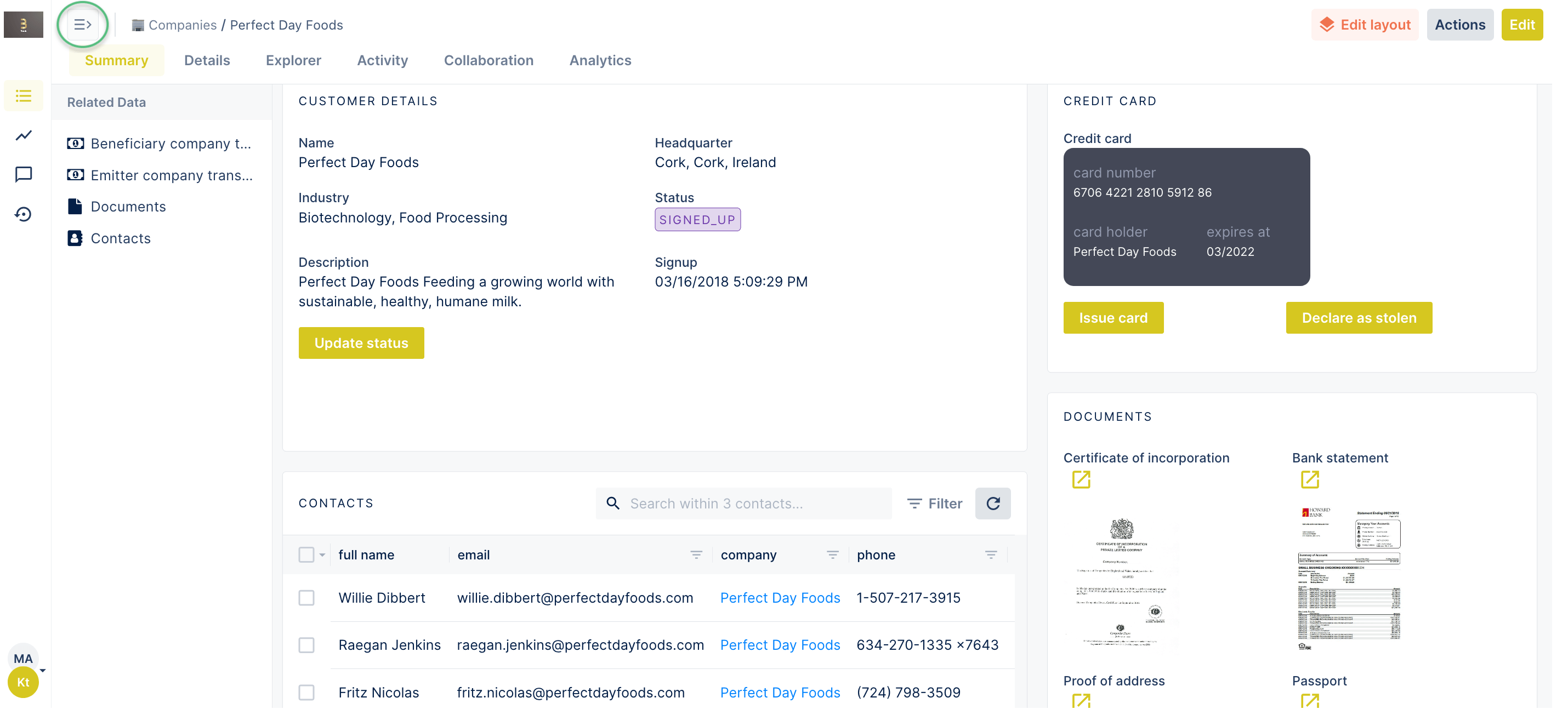
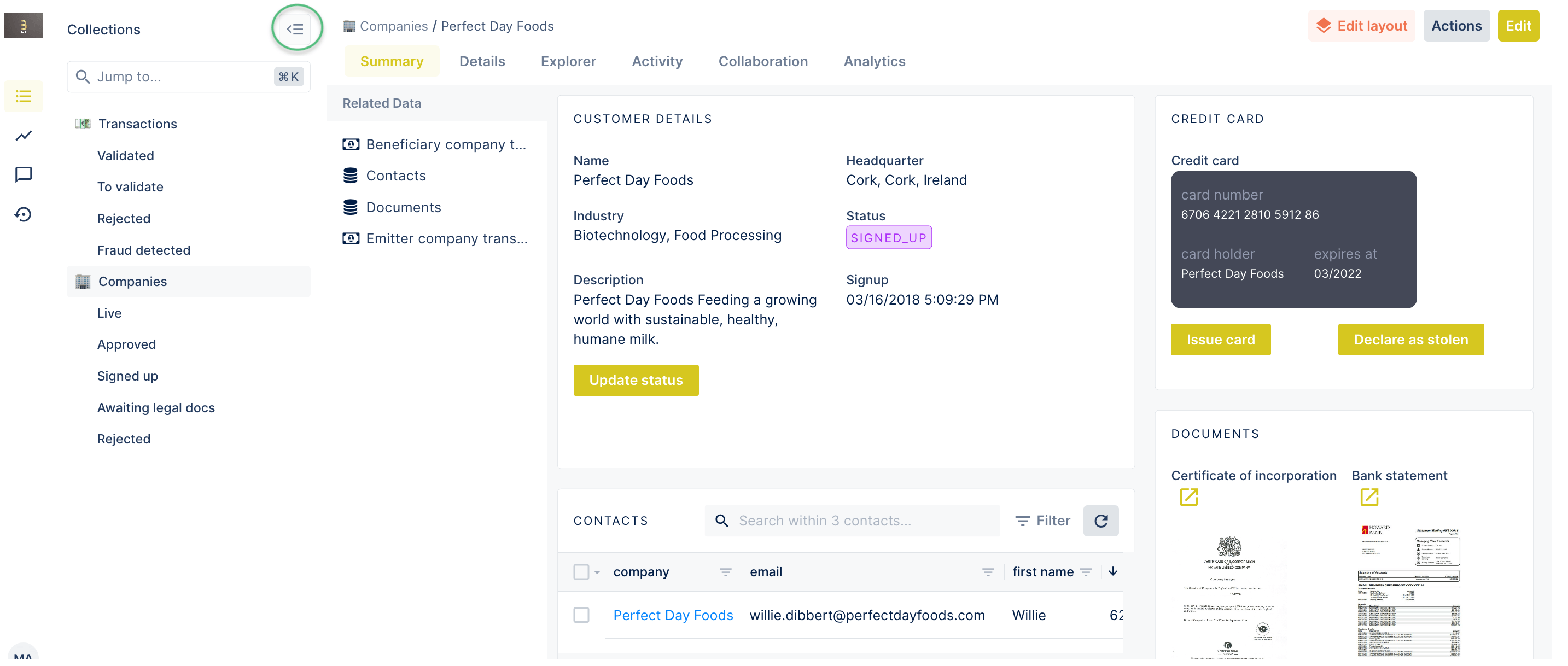
In the screenshot above you can see a panel that holds related data. In the old UI if there weren't any, the panel still appeared even when it was empty. Now, in such a case it remains hidden, which gives you even more space for you data!
The new UI addresses the feedback we frequently received from users who wanted to see as much user data as possible without scrolling. Less space for menus gives more space for details, widgets, and charts.
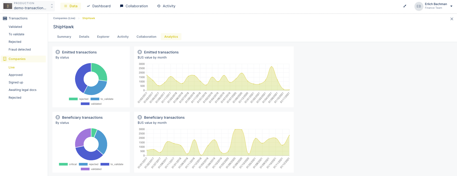
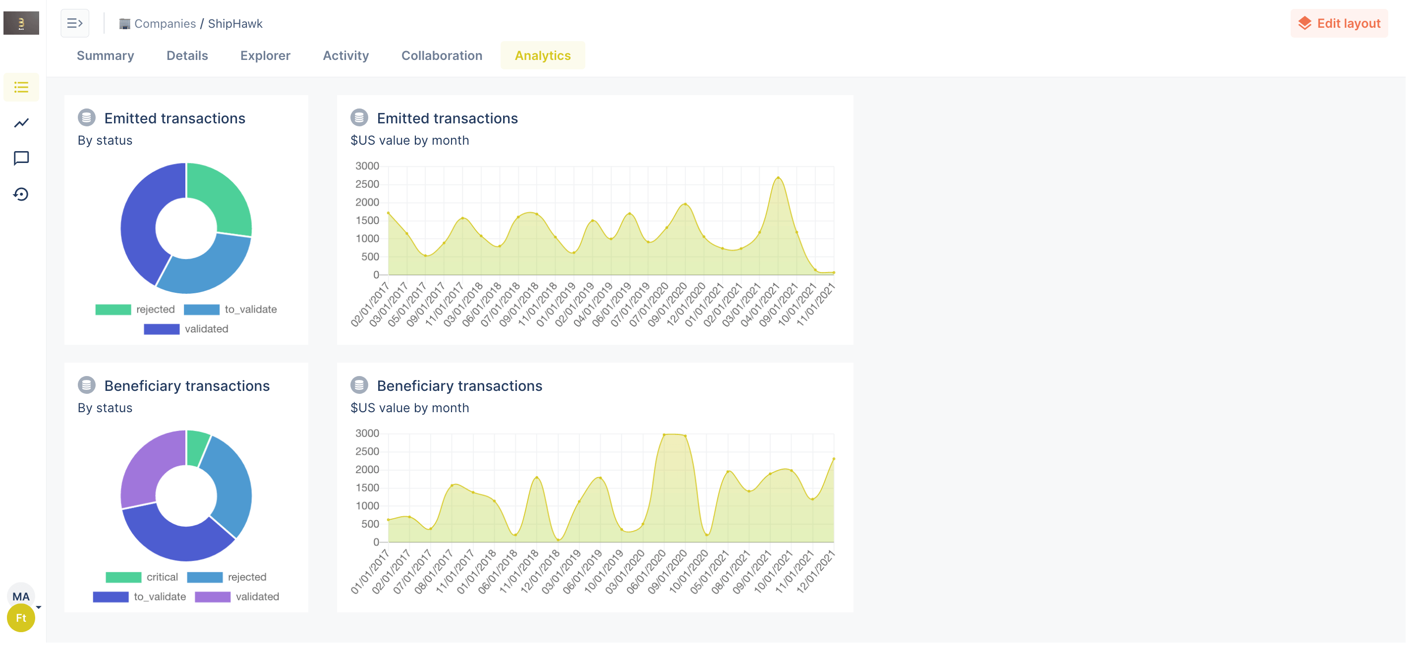
And finally, now you can give your Collections and Dashboards more personal touch with emojis that replace the icons i the new UI. Open the layout editor, click on the settings button next to the collection or the dashboard list and pick any emoji you want. 🌲 🧑🚀 🐈
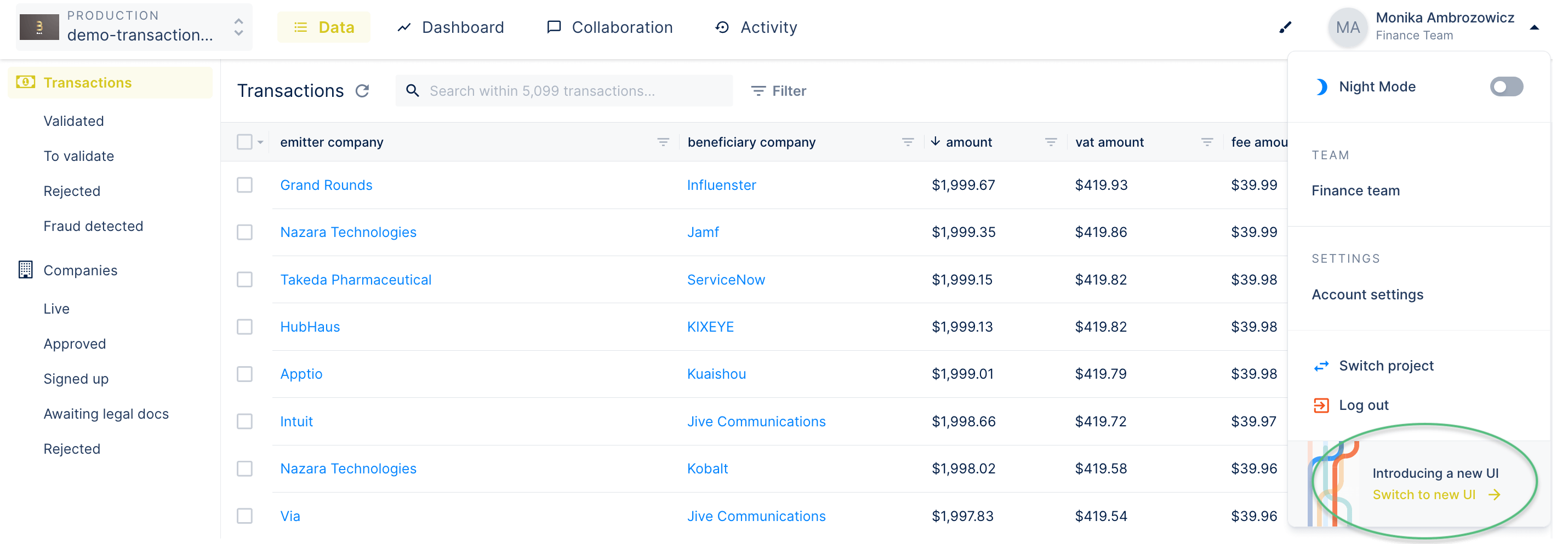
Right now, the old UI is still the default one. If you want to test the new one, click on your name in the top-right corner and click on Switch to new UI. In the next couple of weeks, you are free to switch between the new and old UI. Then, the new UI will become the default one.
We hope you enjoy a clearer and uncluttered view of your user data! If there is anything you want to share with us, please don’t hesitate to drop us a line.
